Have you noticed how some folks like to take the motorway (or highway, or freeway, or Autobahn, or whatever you call it in your country)?
They just want to get to their destination as quickly as possible, no messing around.
Yet other people will avoid the motorway as much as possible. They prefer the meandering back roads, where they can enjoy views of fields of cattle. Or admire the flowers in the gardens of the cottages lining the streets. For these people, the journey is there to be savoured and enjoyed, rather than merely tolerated.
Your website visitors are similar
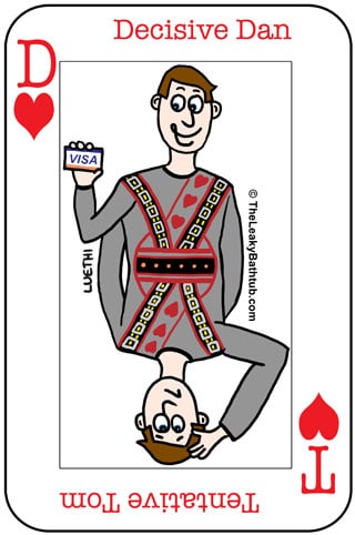
You’ll get some website visitors who just want to get to the information quickety-quick, thank you very much. They want the whole experience to be speedy and with minimum fuss. If they like what’s on offer, they’ll want to buy from you right away; they’ll make a quick, snap decision based on what’s in front of them. This is a Decisive Dan kind of person.
But here’s the thing: not everyone’s a Decisive Dan
Many people like to think about things a little longer, and will often read every page on your website before taking action. Even then, they may just sign up for your email newsletter rather than actually buying anything… they want to suss you out first.
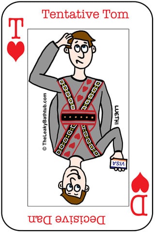
That is a Tentative Tom kind of person
Decisive Dan and Tentative Toms are two extremes; but the extremes do exist. And for your website to have the broadest possible appeal, it needs to address the needs of both Decisive Dan and Tentative Tom, and that’s not always so easy.
The problem is that your own style of buying behaviour is probably reflected in your website
For example, if you’re a Decisive Dan, chances are your website will be brief to the point of being abrupt. There won’t be many pages on the site; and each page might have just a paragraph or two of content.
A Tentative Tom business owner will have quite a different website: expect lots of pages, with lots of copy on each page. (Assuming, that is, they’ve been able to make a decision about their website… maybe they don’t have a website at all, because they’re still deciding!) 😉
You need to wear the opposite shoes for your website to be successful
To get maximum results online, your website will need to address the needs of both Decisive Dan and Tentative Tom. After all, if you don’t, you’ll be losing out on a significant number of prospects.
Therefore if you’re a Decisive Dan, you need to look at your website through the eyes of a Tentative Tom. That means putting yourself in their shoes to see what your website might be missing.
Not sure what on earth these frustratingly hesitant and dithering people might want?
Let’s be clear: Tentative Tom has money to spend, and is researching your industry to find his perfect supplier. But he is looking for total reassurance that your product or service will meet their needs. And it’s up to you to (and your website) to convince him to spend.

Here are the kinds of things Tentative Tom will look for on your website:
- About Us page: Your About Us page should include personal bios of key staff, ideally with photos alongside them. Tentative Tom wants to know that he’s doing business with real people (and a real company) and not some kind of scam set up.
- Full contact details: Another way to show Tentative Tom that your business is ‘real’ is to include full contact details. That means a landline phone number, address, and email address as a minimum. Personally, I will not buy from a site that only has an email address or a cell phone number… it’s too risky!
- Guarantee: A risk-reversal mechanism of some kind. The Tentative Tom doesn’t want to take you up on the guarantee; what he’s looking for is that you stand by your own products. A lack of guarantee will deemed to be suspicious – especially if your competitors are prepared to offer a risk-reversal mechanism such as a guarantee. It’s also important that your guarantee appears genuine, rather than vague. Therefore you should outline exactly how the guarantee works; any conditions; and what the guarantee procedure is.
- Testimonials: Tentative Tom wants to be sure that you have other happy customers. It’s not enough to have a Testimonials page; these testimonials must be believable. The best testimonials will directly tackle the major objections people have to your product or service. And adding a photograph of the testimonial giver makes their statement far more plausible.
- Case studies: A good case study will go deeper than a testimonial, as it outlines the problem (the “before” situation); the solution (the “after” result); and the specific steps taken to achieve these results. The more specific you can be, the better: just be sure you have your client’s permission to share their information. And make sure you do use your own case studies (or “before and afters”) rather than generic ones; your own stories will have much more impact.
- Good amount of detail on products/services: Tentative Tom will want to know exactly what he’s buying – so be sure to spell it out in some details. Provide photos or other graphics where possible, for added authenticity.
- Frequently Asked Questions (FAQs) page: A good way to give Tentative Tom all the information he needs (but without cluttering up your product/service pages too much) is to provide an FAQs page – or even a number of FAQs pages. (For example, an FAQs page for each different product or service.) These pages are a great idea anyway, as they can cut down the amount of time you spend answering the same questions over and over: they are great time savers!
- Value-added information: Things like informational articles and videos go a long way in demonstrating your expertise in your industry. It shows that you really know your stuff, and elevates your status versus your competitors who aren’t doing this. You can put this kind of info into a Blog, or else have a section called Resources or Articles. (Use whatever terminology you’re comfortable with, and that will resonate with your customers.)
- The buying process: How do people buy from you? Don’t just assume it’s obvious, especially if you’re a service-based business. Have a dedicated page called “The Process” or “How it Works” and outline the steps of the buying process. That way, Tentative Tom will begin to picture himself taking these steps.
- E-commerce sites: If you have an e-commerce website, be sure to have a page called “Customer Service” (or similar) with detailed shipping and returns information.
- Invite contact: Make it easy for people to contact you on your website. Tentative Tom will often have a pre-purchase question; and the speed and tone of your reply will impact greatly on whether he buys from you or not.
Daunted by that list? You shouldn’t be; a professional website from a professionally-run business should have these things as standard.
Remember, it’s all about conversion: if you want your website to convert visitors into customers, you need to give your prospects all the information they need before they buy.
But what about Decisive Dan? How to make a website appeal to him?
Decisive Dan is a different beast altogether. The thought of having to read long pages of blurb will make Dan perspire with anxiety!
There are two ways you can handle Decisive Dan:
1. Make it easy for Decisive Dan to reach his destination
Just like the motorway-lover will keep an eye out for road signs leading them to the motorway, you can give Decisive Dan cues on where to go. That means letting him skip through the information, so he can get to his destination more quickly. There will be some specific tips on how to do that in the next article in this mini-series.
2. Force Decisive Dan to read through everything
Yep, in some instances you might want to force Decisive Dan to read everything, regardless. And that’s very much the approach I take on my website: the sales pages for my marketing eBooks are long. And the information on my Services is just as long.
Why? It prevents misunderstandings further down the track. Let me explain, by showing you two examples from my own business:
eBooks
I want people to know exactly what they’re buying upfront. That way, they will be happy with their eBook purchase, and more likely to recommend me to their friends and colleagues. It is a good way of keeping refunds to a minimum, and maximising customer satisfaction. It’s important to me to have happy customers who get value from my materials.
Services
Buying an eBook is a pretty low level of commitment compared to engaging my marketing consulting or website copywriting services. Before people contact me, it’s vital that they understand what I do, how I work, and how I can help them. I want them to be sure that I’m the right kind of person to work with them. The people who do not read my Services sales pages are invariably the people who turn into ‘problem’ customers, and who ask me to perform tasks that are not within my area of expertise. (It doesn’t help that “marketing” is such a vague term, so the expectations can vary significantly.) This ends up being frustrating for both the customer and for me, so I’d rather not get into that situation in the first place.
I now do my best to “force” people to read my Sales page. How? I ask them if they want the Basic or Premium option. (Most services have these two choices.) And the information on the Basic or Premium packages is right at the bottom of the sales page, so they have to read (or at least skim read) the whole page to find it.)
In short: I’ve set up my website so it selects-in the right kind of customer, and it selects-out the customers I’d probably clash with.
It’s all about creating a website process that achieves your business goals
As you might have gathered from these examples, I am very much a Tentative Tom, and I’ve adopted a well-thought-out technique to deal with my opposite, Decisive Dan. It really works well for me; it’s a system I’ve been testing and fine-tuning for a number of years now.
But that’s just me: for many businesses it makes sense to appeal to both Decisive Dan and Tentative Tom, or they’re missing out on valuable sales. So if you’re wondering how your website can perform better for your business, remember to think about your opposite personality type, and how want to deal with them.
And whether you mull this over as you’re zooming down the motorway or meandering through back-country lanes… well, that’s completely up to you!
Summary
- To maximise your website’s effectiveness, it should appeal to all kinds of decision makers:
- Decisive Dan makes quick, snap decisions with minimum fuss.
- Tentative Tom will read all the small print and details before making contact.
- Tentative Tom will want to see the following on your website:
- About us page
- Full contact details
- Guarantee
- Testimonials
- Case studies
- Detailed information on products/services
- Frequently Asked Questions (FAQs) page
- Value-added information via a Blog, or else a Resources or Articles section on your website
- Explanation of the buying process
- Customer service page on e-commerce sites with Delivery and Returns information
- Easy ways to contact you if there are any queries or questions.
- Decisive Dan will want to be shown the quickest route possible to buy from you… and that’ll be covered in more detail next time.


