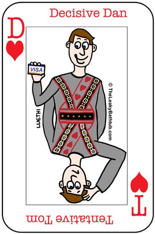
Last time we looked at how Decisive Dan and Tentative Tom behave differently online.
Tentative Tom will want to read almost every page before making a purchasing decision.
Decisive Dan, on the other hand, wants to skip to the important stuff, and now!
How do you give both types of website users the information they need?
Let’s say you have a sales page of some kind on your website, and you want it to appeal to both Decisive Dan and Tentative Tom. This sales page could be for just about anything:
- Your service that you sell (be it building, copywriting, beauty therapy, and so on).
- Physical products, such as cosmetics, books, dog food, and so on.
- Online products, such as eBooks, online courses, audio, and so on.
… in short, just about anything! We all have a sales page of some kind on our website (well, you should do anyway).
How would Tentative Tom read your sales page?
Tentative Tom will read everything on your sales page, and at least once. In fact, he’ll want all the information and then some more. For example:
- For a service, he’d like to read reviews and testimonials, to see what other clients think.
- For a product, he’d like reviews as well, but also an ingredients list.
Making Decisive Dan read through all this stuff would drive him nuts!
So how can you make your sales page appeal to both Decisive Dan and Tentative Tom?
Here’s how you can make a sales page appeal to both types of website users.
This assumes that you want to give Decisive Dan a quick and easy route; in my last article I gave some examples as to why you might not want to do this.
But in this instance, let’s assume you want to give your website wide appeal. Here’s how to do it.
1. Write a few paragraphs with the most pertinent information
These initial paragraphs will give Decisive Dan all the information he needs: just a short, sharp, concise summary.
Then give him a prominent call-to-action: which brings us to point number 2…
2. Provide multiple calls-to-action
Decisive Dan will want a prominent call-to-action (such as a “Buy Now” button) that’s easy to spot. This highly-visible button should show on your web page without him having to scroll to see it. (The technical term for this is “above the fold”.)
Here’s an example from MailChimp email newsletter software: there’s a big, prominent call-to-action button above the fold. Notice too how the button is in a bright, contrasting colour so that the call-to-action really stands out. That’s another technique that Decisive Dan will love.
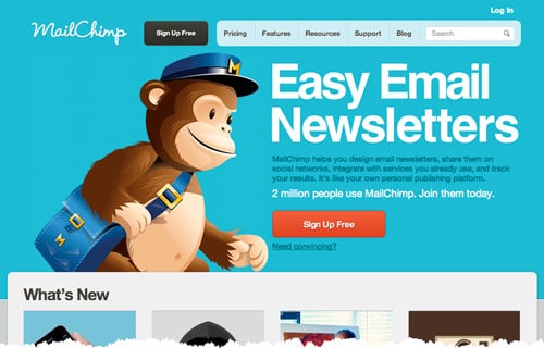
But do you see what else they’ve done? Right underneath the button there’s a hyperlink, “Need convincing?” Here’s a close-up:
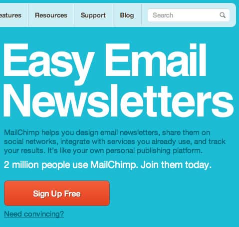
Tentative Tom will be very happy about this link, because it will take him to a long and detailed “Why MailChimp?” page:

Best of all, at the bottom of the page there’s another prominent call-to-action. This is vital; you don’t want website visitors reaching the bottom of the page and then wondering what to do next, and deciding if it’s worth scrolling back up to the top. You need to give them a prominent call-to-action there and then.
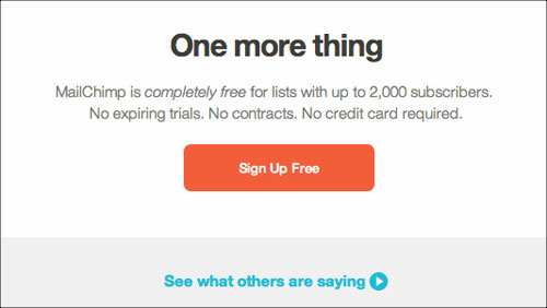
What’s super cool about this MailChimp example is that there’s another, more subtle, call-to-action underneath for the Tentative Tom who is still in research mode. They’ve made it easy for him to read the testimonials.
Every single page on your website should have a call-to-action:
- Above the fold (if you want to attract the Decisive Dan type of person); and
- At the bottom of the page. Even Decisive Dan will be frustrated if he scrolls down and doesn’t know where to go next!
3. Provide your contact details in case of questions
Think that your job’s done there? Nope, not quite yet.
Chances are that Tentative Tom might still have some more questions lurking in his mind, so encourage him to contact you. Provide your email address, so that Tentative Tom can easily get in touch with any questions.
Even if he doesn’t get in touch with you, Tentative Tom will be reassured by the very fact that your email address is there. It makes your business look real, genuine, helpful.
Decisive Dan will appreciate having your contact information on hand too. For his benefit, you should put your contact details on each web page (for example in the header or footer) so he doesn’t have to go searching for it.
Hint: Even if you have a contact form, you should still include your email address. Here’s why.
Wow, that’s a mighty long web page – is there any way I can shorten it?
If the thought of such a long page makes you shudder, here’s how you can shorten it. It’s a technique used by many ecommerce websites. And that is to use “tabs” for the information, like this:
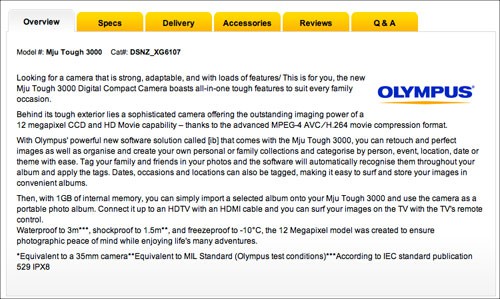
This means that all the information is there, but without a long sales page… what a great way to keep both Decisive Dan and Tentative Tom happy!
And if you can keep all types of website users happy, your website’s conversion rates will be maximised.
Summary
To encourage both Decisive Dan and Tentative Tom to take action online, your website should provide:
- A short summary of what you do (for Decisive Dan’s benefit).
- A prominent call-to-action above the fold (for Decisive Dan’s benefit).
- Detailed information on your product or service, either on the same page or using tabs. And link to other pages when necessary. (This is for Tentative Tom’s benefit.)
- A prominent call-to-action at the foot of every web page. (This is for everyone’s benefit.)
- Full contact details, including your email address, on every page of your website. Again, this is for everyone’s benefit.


