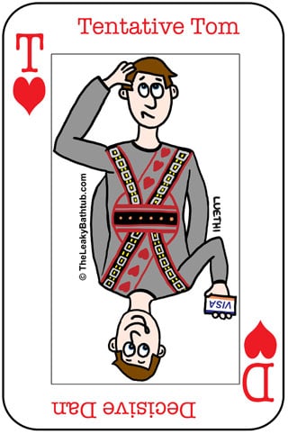
One of the questions I get asked a lot by clients is, “how can I get more email newsletter sign ups on my website?”
The very first thing I do is to look at the client’s website to see if the sign up process will appeal to both Decisive Dan and Tentative Tom.
I’ve written about Decisive Dan and Tentative Tom before, and how they behave differently online. In previous articles you’ve seen how you need to take both user types into consideration when structuring your website content, and also when creating sales pages.
But you also need to take both of these website user types into consideration when you want more email newsletter sign ups.
Here’s how you can get both Decisive Dan and Tentative Tom to sign up to your email newsletter.
Both Decisive Dan and Tentative Tom need to be enticed to sign up
It seems that eeeeeveryone is offering email newsletters these days. And you have to earn (a) your place in prospects’ mailboxes, and (b) getting your newsletters read, rather than trashed.
How do you do that? With a free enticement of some sort. This freebie needs to be something that:
- Recipients receive immediately. Instant gratification is key; if there’s a delay they’ll have forgotten about you. Therefore delivery needs to be automatic and automated (which is why email newsletter software such as AWeber and MailChimp is so neat, it does all that for you).
- Is in some kind of digital format… after all, the computer will be delivering it for you. This digital file is something that people can either read, view, listen to or watch on their computers. It could be a written report; or an audio file; or a video… or for best effect, a mixture of these. (Why a mixture? Not everyone likes all formats – some people are visual, some are auditory, some are kinesthetic. The more people your offer appeals to, the wider the take up.)
- Encourages foot traffic. Digital content isn’t suitable for all business types. Or you might want to do something a bit extra. For example, if you’re a retailer you might want to offer a digital “buyers’ guide” – but you might want to supplement that with a time limited offer to receive an in store consultation.
- Adds value to what you do. The freebie should be something that helps to answer a problem that all your prospects share. It’s something that’ll help them in their lives, and establishes you as a credible expert.
- Has enticing packaging. Packaging sells! Even though you’re sending something digital, get a graphic designer to make it look like a real product. There’s special software (for example Cover Action Pro PhotoShop add-on) that can mock up books, CDs, DVDs, magazines, and a whole lot more.
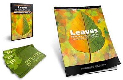
Both Decisive Dan and Tentative Tom will love this enticing packaging. There’s not much point in having a great freebie on offer, but it doesn’t look enticing. Give it some zing!
That’s where Dan and Tom’s similarities end… from now on, they want different things from your website. Yes, you can please them both – here’s how to do it! We’ll start with Decisive Dan…
Decisive Dan will want the minimum fuss and hoopla
To entice Decisive Dan to sign up to your newsletter, you need to make it easy for him. And the best way to do that is to have a sign up form right there, on most pages of your website.
(How do you get a sign up box onto your website? If you use an email newsletter system such as AWeber or MailChimp, it gives you a code that you or your website developer will need to add to your website.)
This sign up box should be in a prominent position, rather than tucked away somewhere down the bottom.
Very often, a Decisive Dan kind of person won’t scroll down the page, so you need to make it obvious!
How to make the sign up box obvious
A good way to make the sign up box obvious is to feature it prominently on every web page. My preferred space is at the very top of the right hand column (side bar), so that people can see the sign up box without having to scroll.
For example, on my own site, the sign up box appears at the top of the right hand column of most pages, as follows:
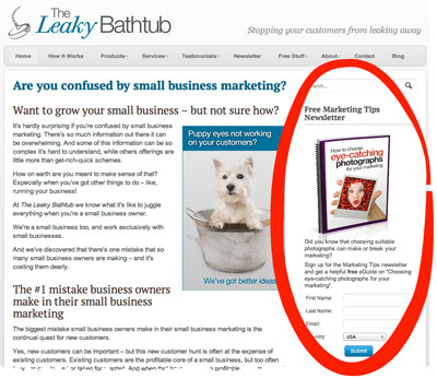
My sign-up box is quite subtle (I’m not into garish colours!).
But the email sign up box on this website, below, is brightly coloured to make it stand out:
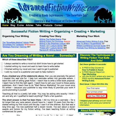
It’s not the prettiest looking website (or sign up box), but Randy Ingermanson has more than 30,000 email subscribers, so it definitely works for him!
Other techniques to get more email newsletter sign ups from Decisive Dan
There are other techniques you can use to grab Decisive Dan’s attention. These include pop-up boxes, which can be programmed to appear immediately when someone visits your site, or after a set amount of time.
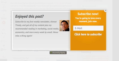
Personally I don’t like these pop-up boxes, they really annoy me… though apparently they do work well. I don’t want to inflict them on my readers, seeing as I dislike these pop-ups myself!
But there’s a subtler way to grab Decisive Dan’s attention, and that’s with a Hello Bar.
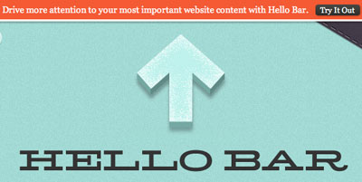
The Hello Bar lets you use any call-to-action you like (be it a newsletter sign ups, or whatever). You can use colour to make it stand out, yet without being too garish. And it can stay at the top of the screen even when people scroll.
For example, here it is on my website:
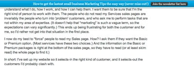
I’m trialling the Hello Bar at the time of writing this; it’s early days yet, but it seems that my subscriber numbers have increased since I started using it. Yes, mine is quite subtle in colour, but garish colours aren’t for me. 😉
So there you have it: Decisive Dan wants it to be as easy as possible to sign up. He likes the sign up box to be attention-grabbing and with no excess information or blurb to hold him up.
What about Tentative Tom? Oooh, I’m glad you asked…
Tentative Tom will want more information before committing to signing up
That’s hardly surprising, that Tentative Tom wants more information before giving you his email address. He wants to:
- Be assured that your newsletter is worth receiving – and including testimonials from other newsletter subscribers will help to sway him.
- Get an idea of how often you’ll email him. Of course, you can change the frequency, but it’s nice for people to know if you’ll be emailing them daily, weekly, fortnightly, quarterly, etc.
- Know that you won’t spam him, or use his details in an underhand way (e.g. sell or give the database to other people or organisations)
- Be reassured that Unsubscribing will be easy, if he does change his mind
- Want to know more about the freebie, to be sure he’ll like it (even though it is free!)
Wow, that’s rather a lot of information! Far too much to fit into your sign up box. That’s why it’s worth having an extra web page with more details.
Notice how I have a little link in the sign up box on my website?
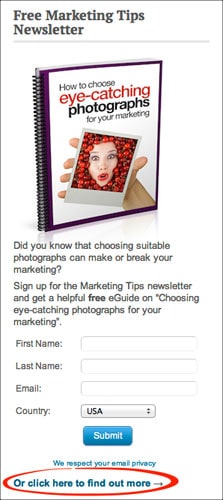
That link is there especially so that Tentative Tom can find out everything he wants to know. The link goes to a special page that answers all his questions; gives some reader testimonials; – and yes, there’s another sign-up box there too.
Another benefit of having such a page is that you have a website address (URL) that you can link to easily, for example from other websites, or social media updates, and so on.
If you don’t have a special newsletter page, it’s harder to drive people to your site for the specific purpose of signing up. So there’s two-fold benefit for having this separate page: it encourages Tentative Tom to sign up, and you have a page that you can link to.
Anyway, here’s a visual of the web page that the link leads to:
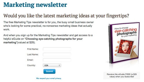
Notice how the sign up box is visible without scrolling; this is for Decisive Dan’s benefit, in case he ends up on this page.
If you scroll down, you’ll see the blurb that will answer Tentative Tom’s questions:
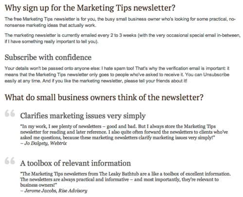
Sneaky bonus tip to get more email newsletter sign ups
I actually have two email newsletter sign up pages on my website. Notice how the one above talks (unsurprisingly) about the newsletter?
Well, sometimes I don’t want to promote the newsletter; I want to promote the free eGuide.
For example, the reverse of my business cards talks about the free eGuide. If I pointed these people towards the page above, they’d be confused, because the connection between the newsletter and free eGuide isn’t obvious at first glance. (Well, not to Decisive Dan, anyway.) Because the connection isn’t instantly obvious, it would make people scratch their head. And that’s dangerous, because while they’re scratching their head with their left hand, their right hand is hovering over the mouse to hit the ‘back’ button and navigate to some other website. Therefore we need to avoid that head scratching! And that where this second page makes a useful landing page.
So when I want to promote the free eGuide, I have a second (hidden) page, that only people with the link can find.
It’s same-same but different to the other page, in that the prominent message is the free eGuide. Sure, it mentions the newsletter too (I don’t want to be misleading!), but the emphasis is different:
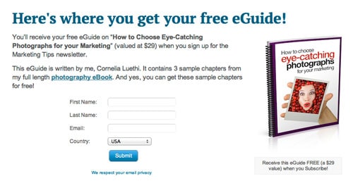
I’ve found it incredibly handy to have two different newsletter sign up pages, and I suggest that you do this too. You can even start measuring to see which page gets the best conversion rate, and learn from that.
Summary
There are many things you can do on your own website to increase the number of email newsletter sign ups:
- Offer an incentive for signing up. And ensure that this incentive is
- in digital format
- delivered immediately
- adds value to what your business does (it must appeal to all your prospects)
- attractively packaged
- Decisive Dan will want the sign up box positioned prominently on the website
- Tentative Tom will want a detail page that gives him more information
- Have two slightly different detail pages (one focusing on the newsletter; the other focusing on the incentive) give you extra flexibility in your marketing.


